Case study 01
Grandad's
Nuts
Client website redesign
A small Caribbean snack brand with a family recipe, bold packaging and a basic website. I rebuilt the site into a responsive branded experience that finally matched the product.
outcome
Shipped
A responsive branded website developed through client feedback and multiple design iterations.
Role
UX/UI Designer
Client
Grandad's Nuts
Timeline
2026
Tools
Figma & Canva
project
Overview
Grandad's Nuts is a small Caribbean-style peanut company built on a family recipe passed down from a grandfather who moved from Guyana to Canada and couldn't find peanuts made the way he liked. The brand already had a playful, handmade personality — a mascot logo, colourful packaging and a real story behind it.
The goal of the project was to transform an early, basic website into a more intentional branded experience: one that showcased the products clearly, communicated the Caribbean roadside-style identity, told the story behind the company, made store and contact information easy to find, worked across desktop and mobile, and stayed consistent with the existing packaging.
Outcome
A responsive branded website developed through client feedback and multiple design iterations.
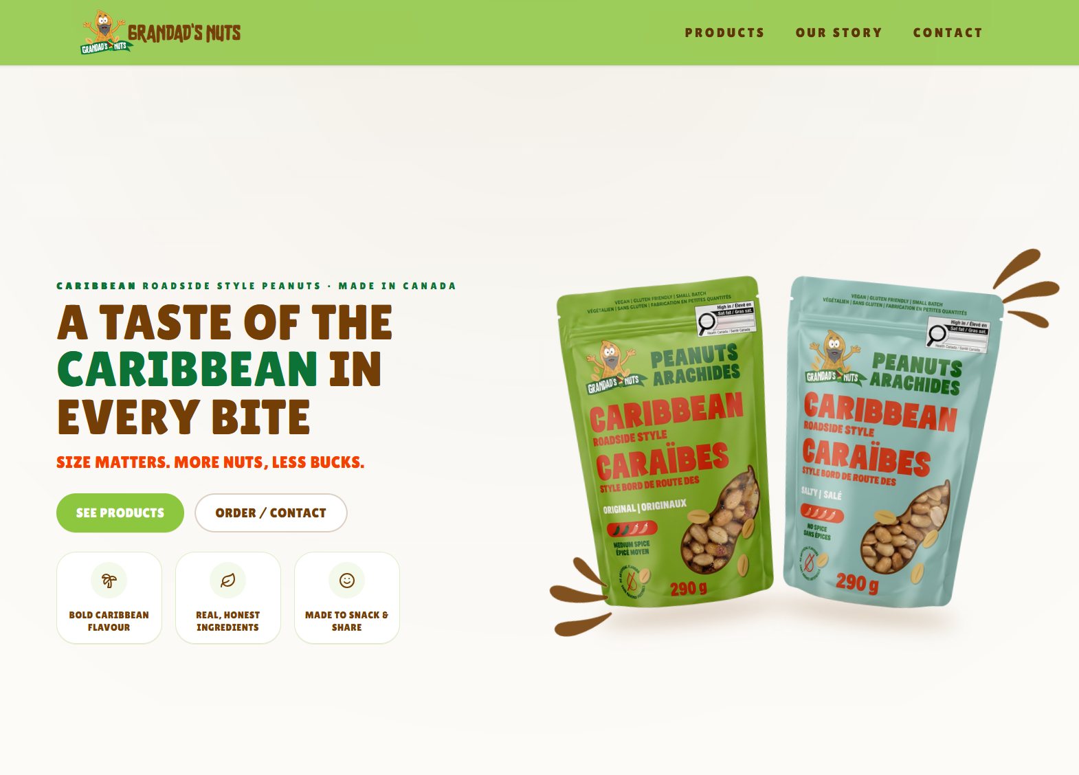
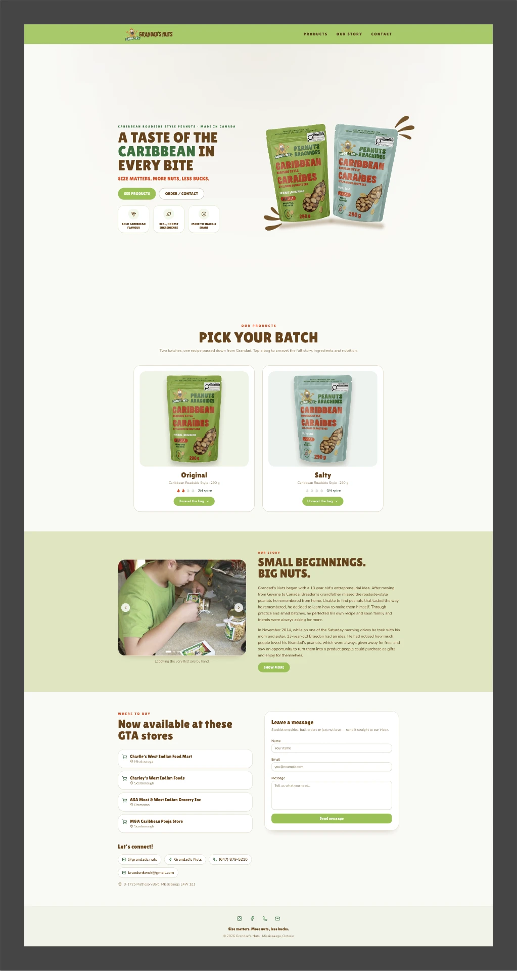
THE SHIPPED SITE.
The product already had personality. The challenge was building a website that finally matched it.
my
Role
Contributions
- Client communication and requirements gathering
- Competitive and visual research
- Wireframing and information architecture
- Colour palette development and typography selection
- Desktop and mobile layout design
- Product presentation and brand storytelling
- UI component design
- Iteration based on client feedback
- Final website implementation
Responsibility
chapter one
Empathize
Understanding the product, the personality behind the brand, and what the client actually needed from the site.
starting point
What already existed
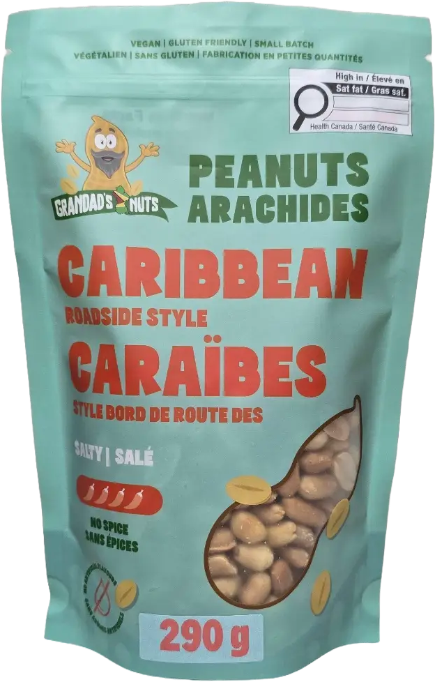
I started by going through everything the brand already had: the logo, the product packaging, existing product photography, the current website, the company history, the tone of voice and where the peanuts were being sold.
In conversation, the client described wanting a site that felt simple, welcoming, playful without feeling childish, Caribbean-inspired, easy to navigate and focused on the actual product.
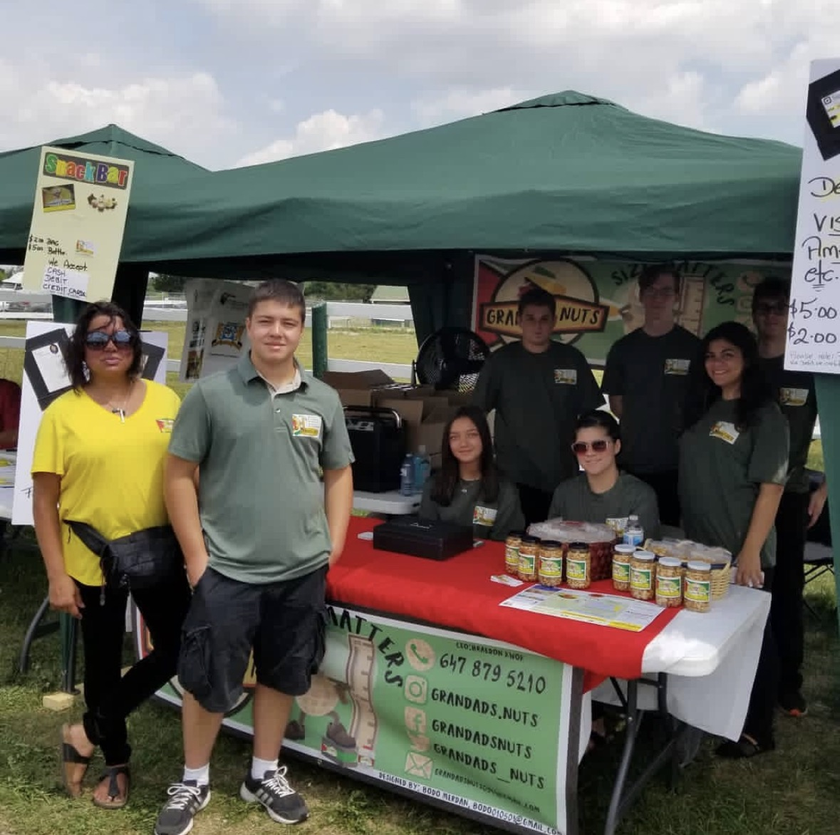
before
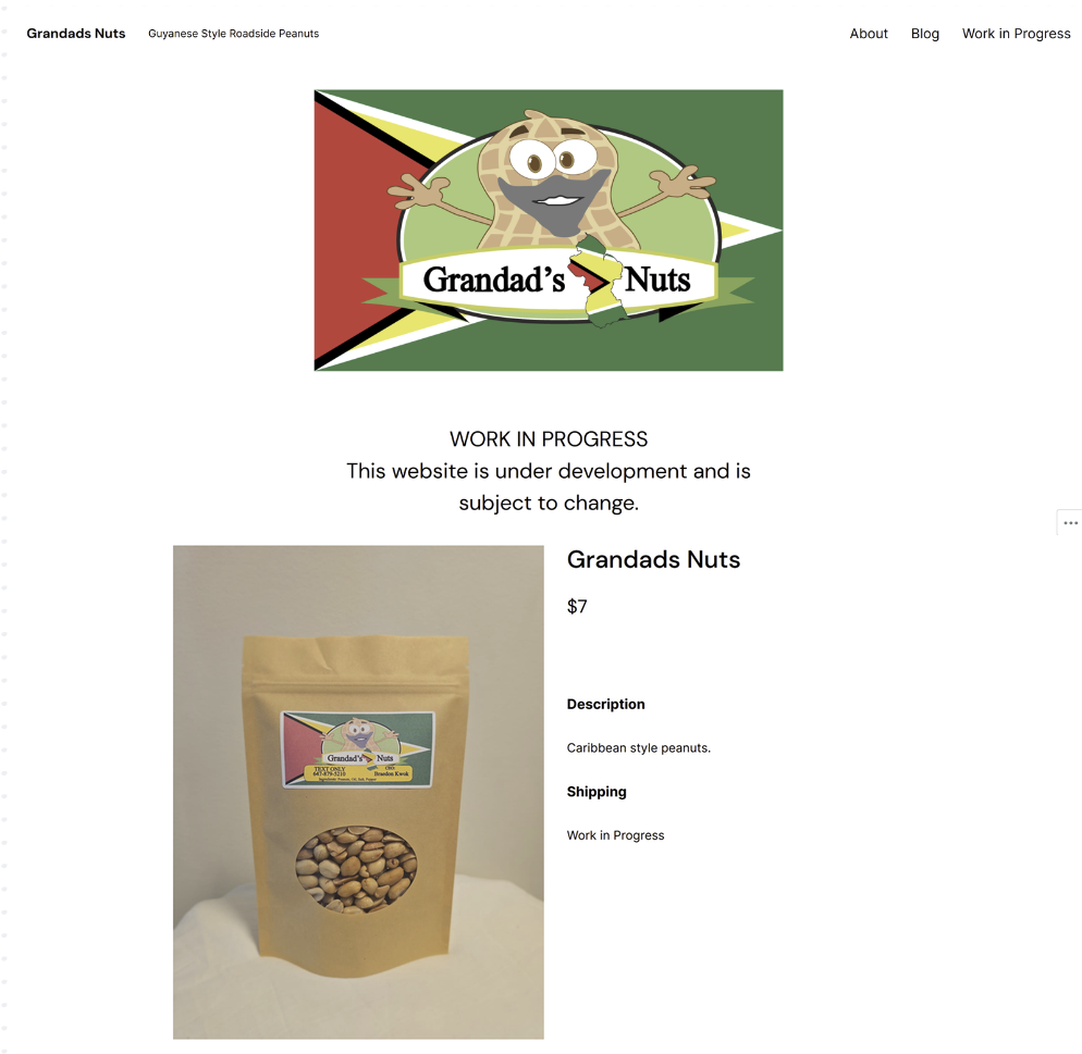
Existing experience
What was missing
- Strong visual hierarchy
- Clear product presentation
- Consistent branding
- Storytelling
- Polished responsive layouts
- A connection between the packaging and the website
Insight
The problem was not creating a new identity. It was communicating an existing personality into a digital experience.
chapter two
Define
Turning a loose brand presence into a focused website brief.
problem
Statement
Grandad's Nuts had a distinctive product and story, but its digital presence did not yet communicate the same personality, quality or clarity as the physical brand.
design
Goals
01
Product first
Make the peanut bags the strongest visual element on the homepage.
02
Simple storytelling
Tell the history of the company without overwhelming users with text.
03
Clear actions
Make Products, Store Locations and Contact easy to reach.
04
Brand consistency
Build a visual system from the existing packaging colours, logo and Caribbean identity.
05
Responsive by design
Ensure the hierarchy still works on mobile rather than simply shrinking the desktop layout.
how might we
Questions
How might we make the website feel as distinctive as the packaging?
How might we communicate the family story without distracting from the products?
How might we use colour without making the interface feel visually crowded?
How might we create a playful brand experience while keeping the site clean and usable?
chapter three
Ideate
Exploring layout, colour, typography and product presentation before committing to a direction.
wireframes
Structure first
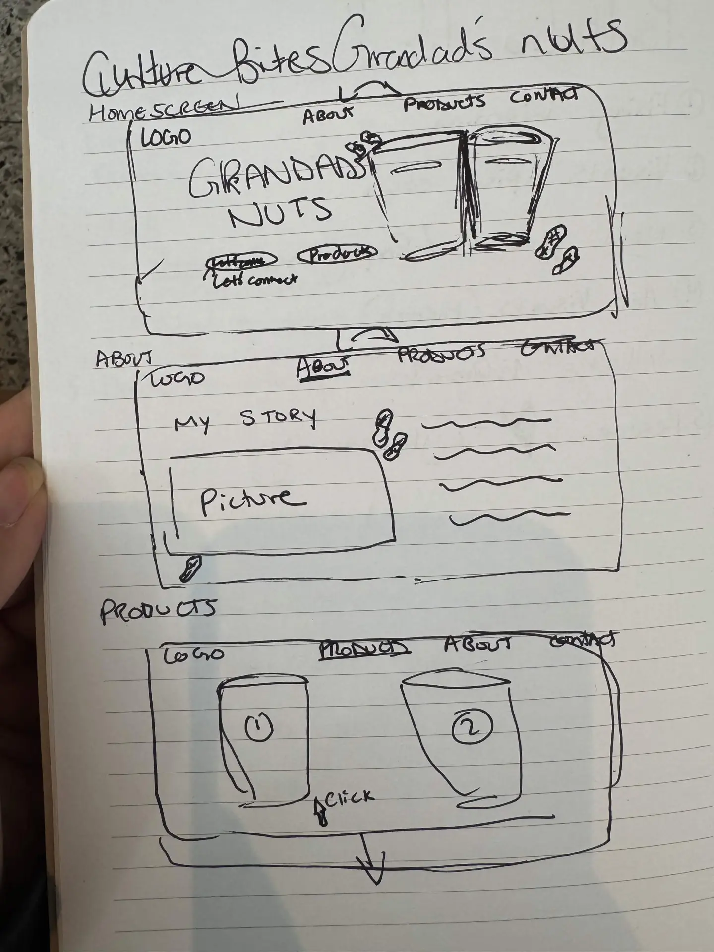
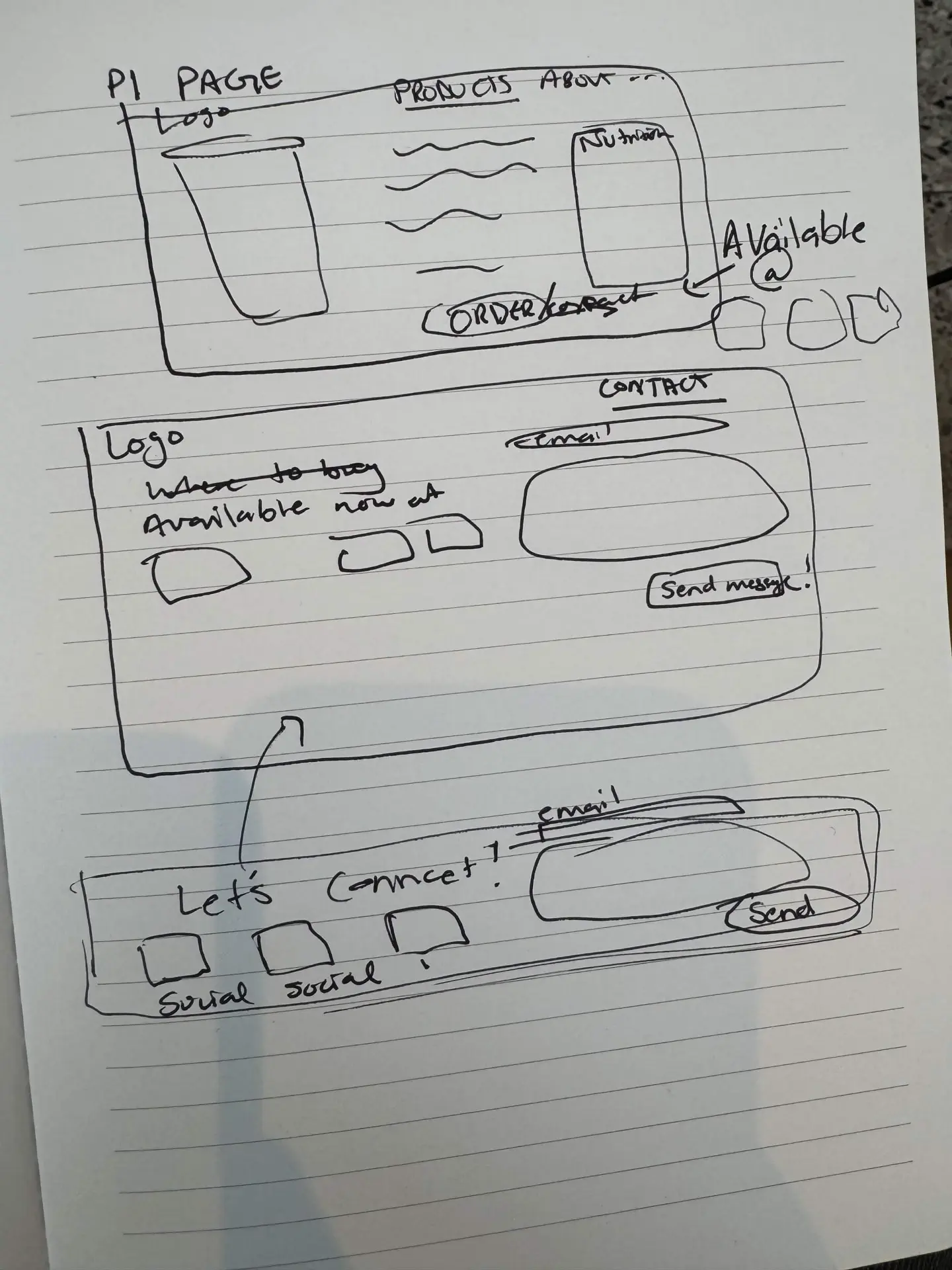
I sketched the site wireframes by hand before moving into high-fidelity design, working out how much space each idea deserved before any colour existed.
visual
Direction
I wanted the site to feel clean and modern while still reflecting Caribbean roadside culture and the playful packaging. Early ideas explored more cultural and decorative patterns, brighter supporting colours, illustrated accents, larger product imagery, product cards and playful microcopy.
Several of these were later reduced or simplified once I saw the full composition — individually they were fun, together they were loud.
colour
Palette
Dark Brown
#4A2C13
Primary heading colour. Creates warmth and connects to the earthy food identity.
Olive / Lime Green
#8DBF4C
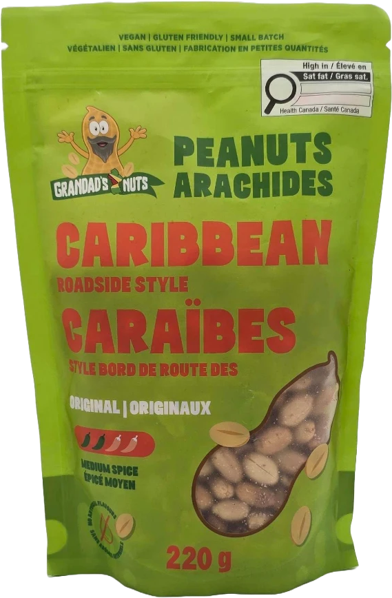
Primary action colour and main brand anchor, pulled from the Original packaging.
Coral / Red
#D2452F
Used sparingly for emphasis, section labels and the slogan.
Cream
#FBF8EC
Main background. Keeps the site warm and gives the packaging room to stand out.
Soft Sage
#E3EBCF
Alternate sections and product backgrounds — separation without another strong colour.
Muted Mustard
#E0B457
Supporting accent only, for icons and small details.
The colour system became more restrained over time. Earlier iterations used more saturated supporting colours, but these began to compete with the packaging — so the final system lets the products provide most of the colour.
typography
Type system
Display
Big nuts.
A bold, condensed display face chosen to echo the chunky hand-lettered type already on the logo and packaging. Used for oversized headings.
Body
Small-batch roadside style peanuts, made from Grandad's Guyanese recipe.
A simple, highly readable sans for body copy, small uppercase section labels and bold CTA text.
chapter four
Design
Turning the brand system and wireframes into the first complete website direction.
first complete
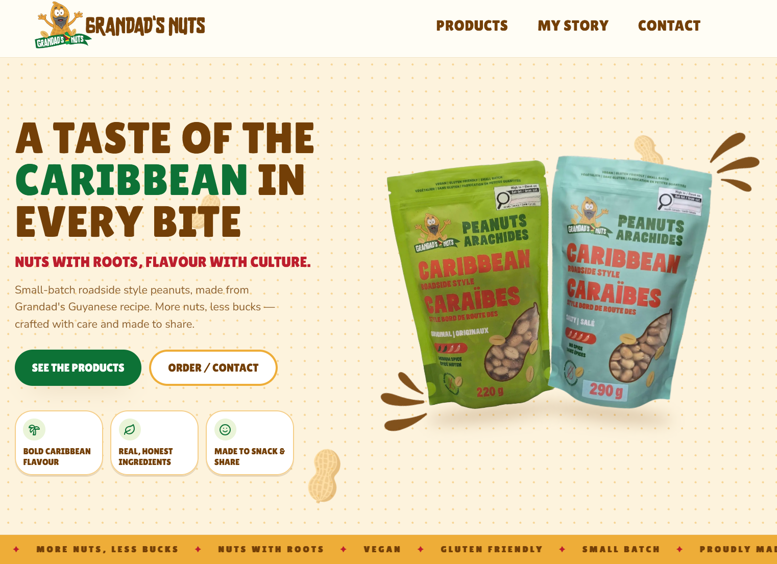
Direction
section by section
WEBSITE BREAKDOWN
Hero
An oversized headline establishes personality immediately, the product bags sit alongside it as the visual anchor, the tagline works as a secondary brand statement, and two clear CTAs (See the products / Order & contact) give the page one obvious next step. Small feature cards communicate flavour, ingredients and shareability.
Product section
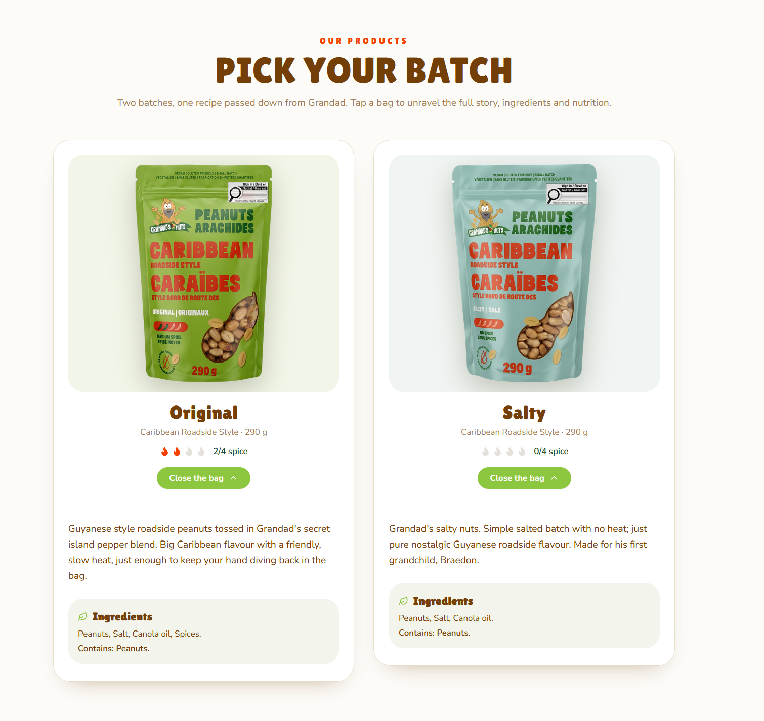
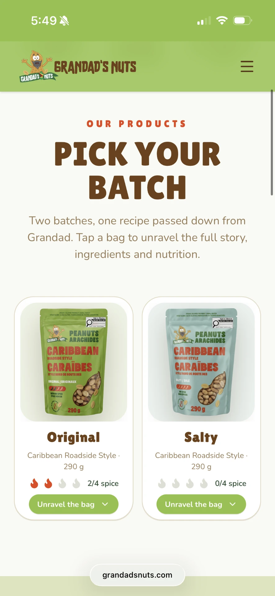
The two products are presented as individual cards so the difference between Original and Salty is immediately understandable: package photography, product size, spice level, expandable product information, and a subtle background colour tied to each package.
Story section
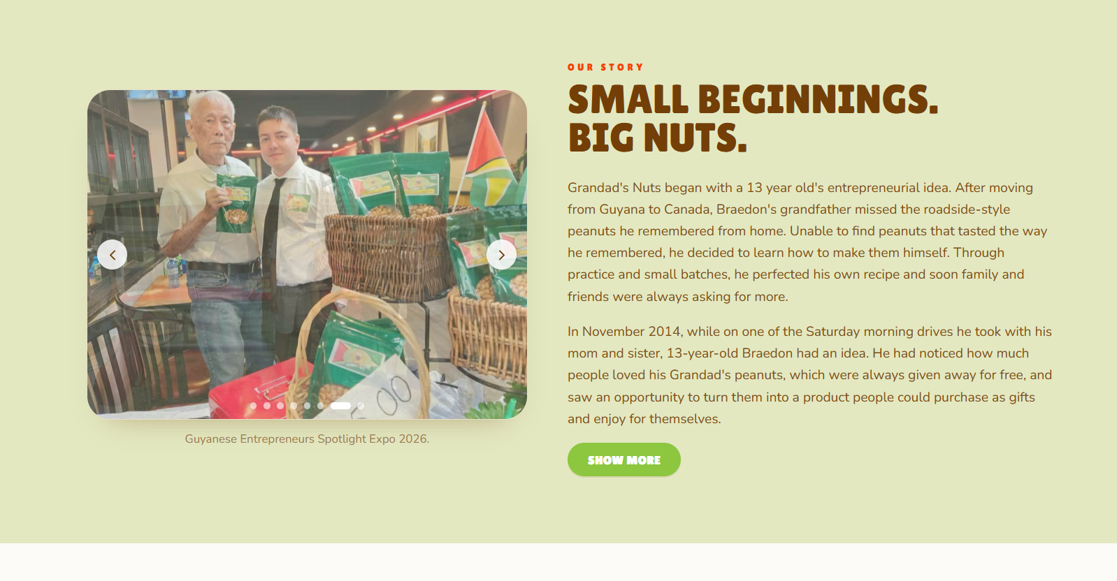
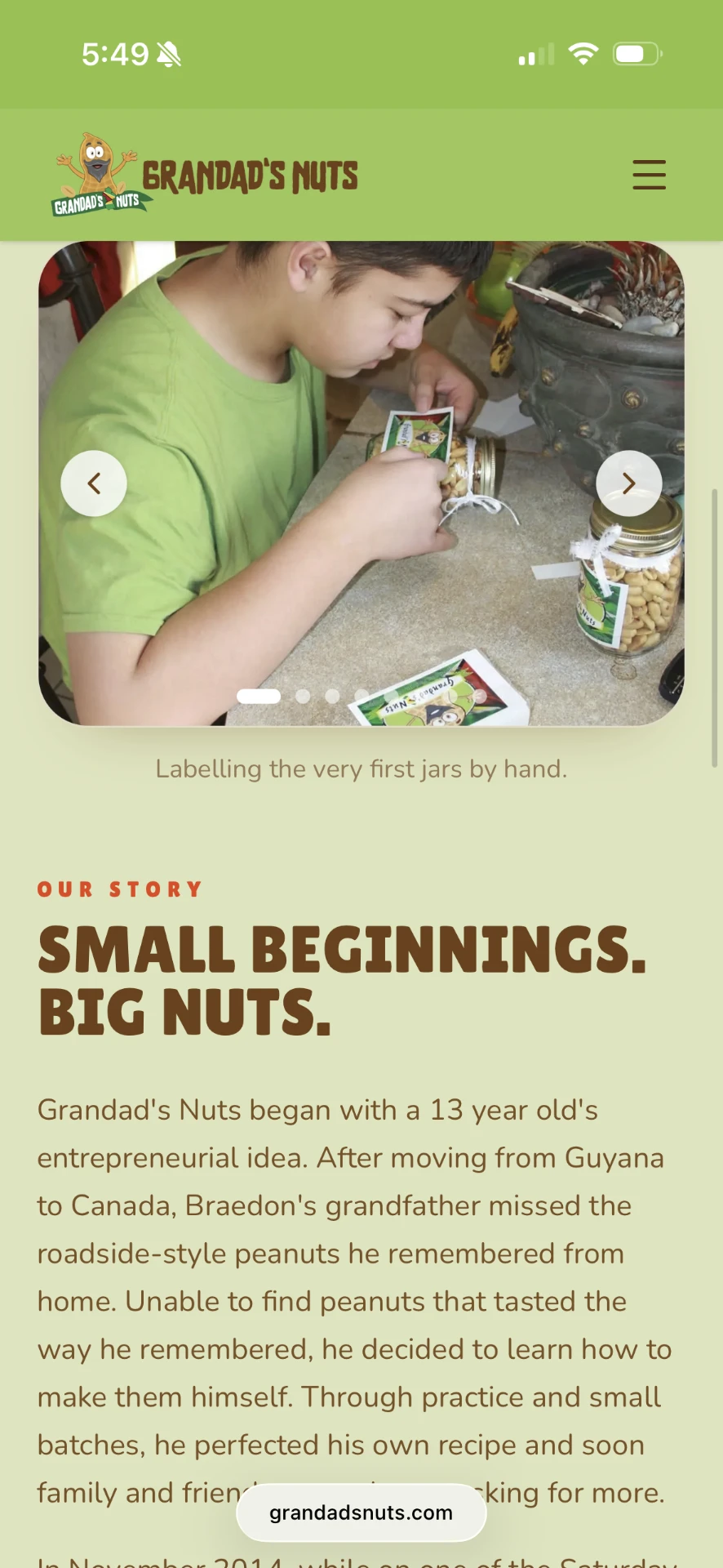
The company story became its own visual section using family imagery under the heading “Small beginnings. Big nuts.” — balancing the playful brand voice with the real history behind the business.
Store + contact
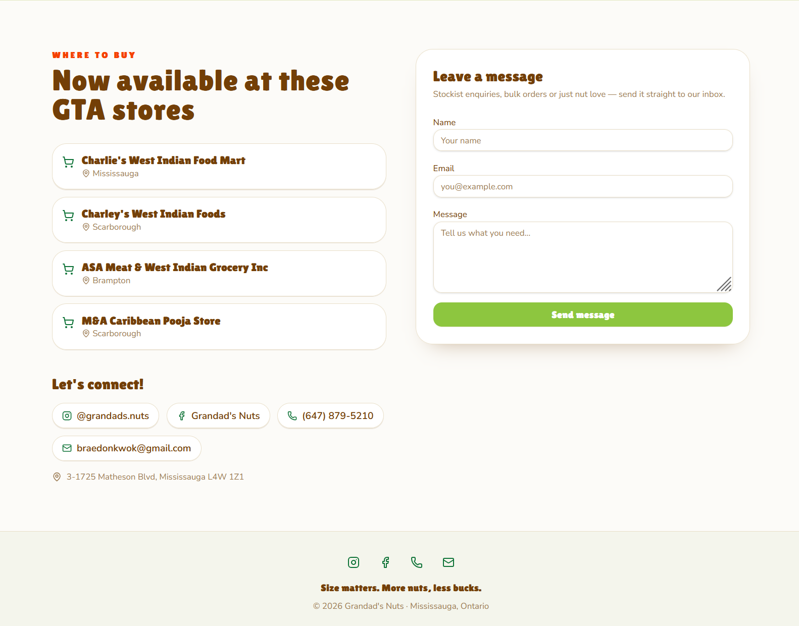
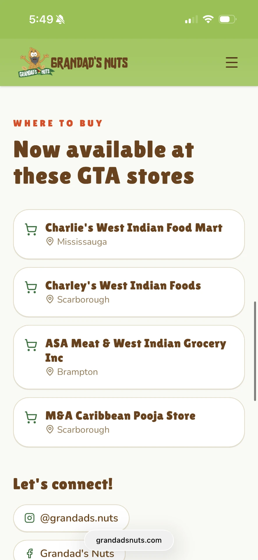
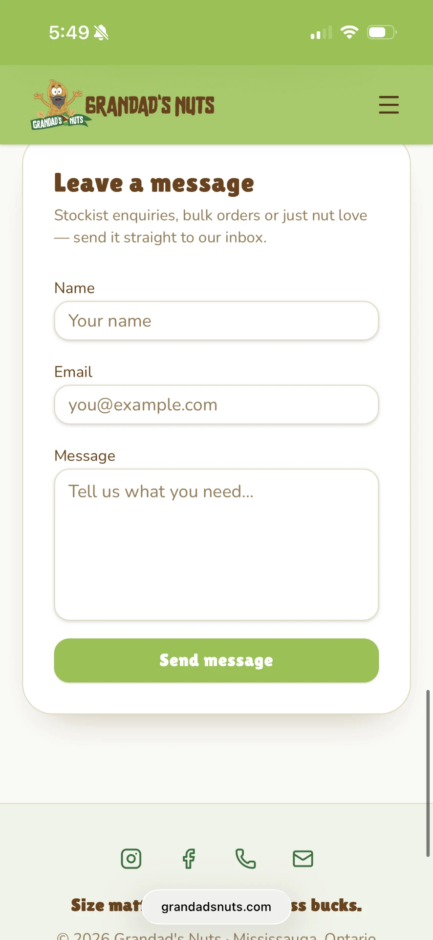
Store locations and contact information sit near the bottom of the homepage, so users can move straight from product interest to buying or getting in touch without hunting through pages.
chapter five
Iterate
The final design did not come from one pass. Client feedback repeatedly changed the visual direction.
version 01
Early website
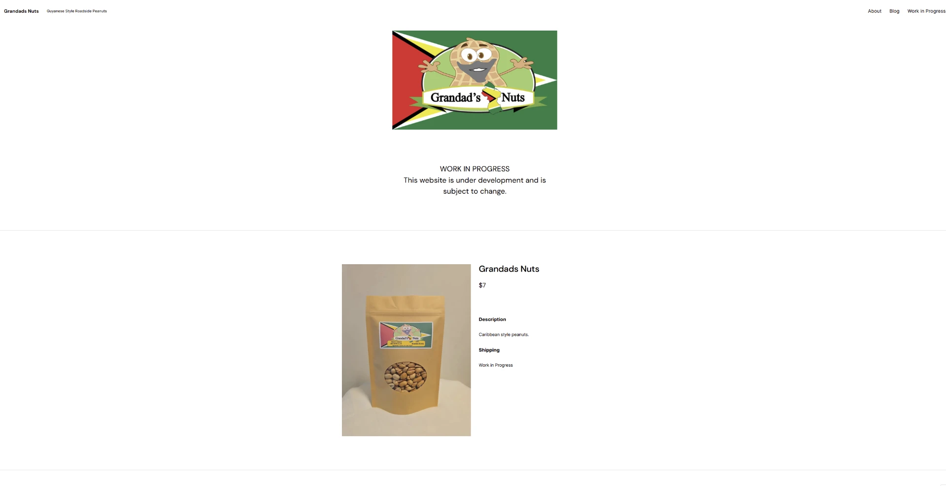
The initial version was functional( a logo, a product, a price) but visually disconnected from the packaging and without any real hierarchy. Nothing told a first-time visitor what the product tasted like, where it came from, or where to get it.
version 02
First redesign
What changed
- Stronger typography
- Larger product photography
- Stronger Caribbean visual identity
- Patterned background
- Brighter colours
- Product-focused hero
- Feature cards
- New navigation and CTA structure
What I learned
This direction had more personality, but it also introduced too many competing visual elements. The background pattern, strong accent colours, packaging and feature cards were all asking for attention at the same time.
client
Feedback
Simplify
Reduce decorative elements and simplify the overall visual direction.
Products forward
Make the products stand out more than the surrounding interface.
Cleaner + cohesive
Keep the experience cleaner and make the sections feel like one system.
Spacing
Improve spacing so sections breathe instead of stacking tightly.
Mobile
Refine mobile layouts rather than letting them inherit desktop scale.
Story & practicality
Strengthen the family story and make store and contact information more practical.
This feedback wasn't cosmetic. It changed the structural direction of the design; the pattern, the accent system and the feature cards were all rebuilt as a result.
version 03
Final direction
01
Removed visual noise
The patterned hero background was replaced with a warm cream background so the packaging became the strongest source of colour.
02
Refined the colour system
Supporting colours became softer and more controlled.
03
Simplified feature cards
Large saturated blocks became subtle neutral components, with colour carried mostly through the icons.
04
Improved product hierarchy
Product imagery was enlarged and given more breathing room.
05
Refined storytelling
The story section received a dedicated background treatment and stronger heading hierarchy.
06
Improved mobile behaviour
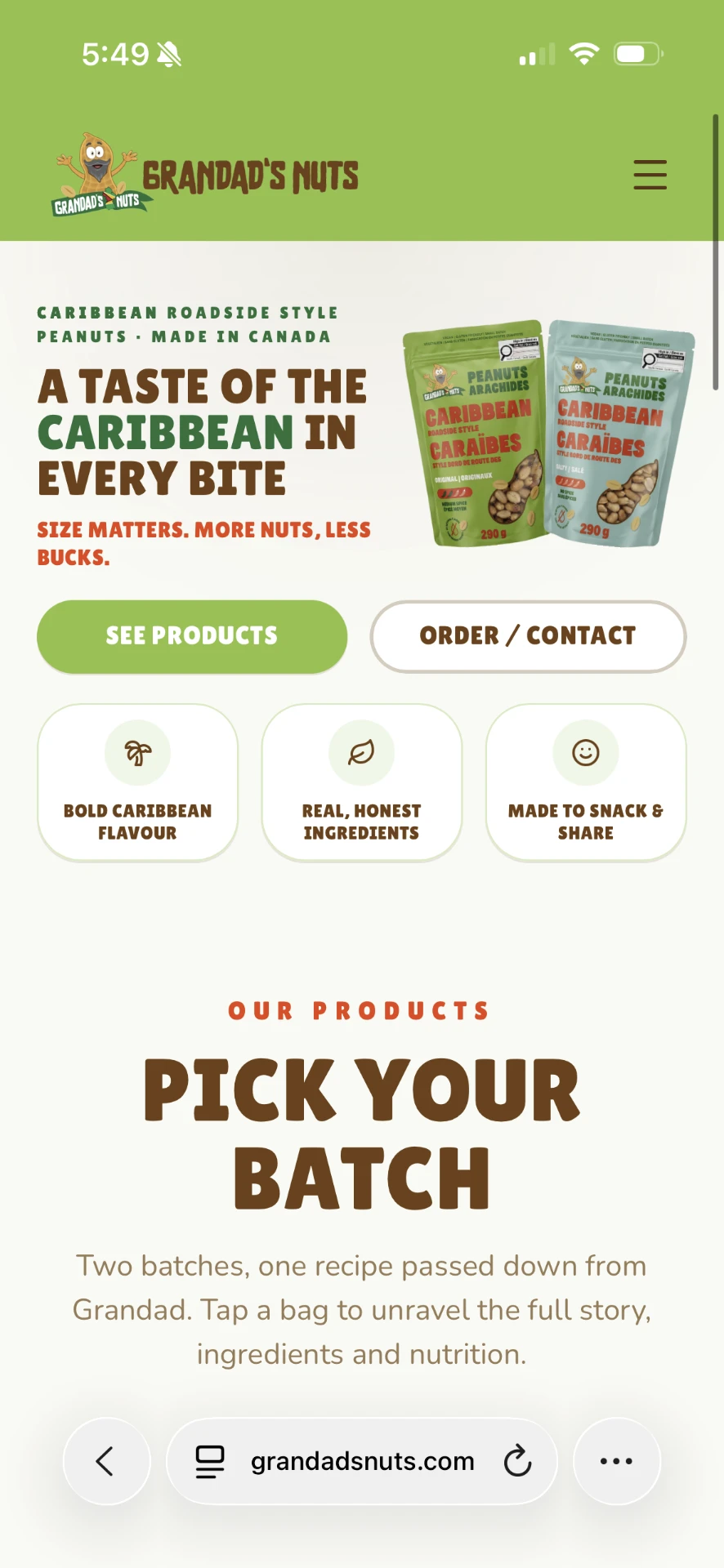
Spacing, typography, image scale and multi-column sections were adjusted specifically for smaller screens.
side by side
Original → Exploration → Final
Original
Functional, but disconnected from the brand.
Exploration
More personality, too many competing elements.
Final
Restrained system, packaging leads.
finale
Final design
A cleaner system that lets the packaging, personality and story do the work.
final
The website
responsive
On a phone
Most visitors arrive from Instagram on a phone, so the mobile layout got its own pass: stacked packaging, full-width buttons and tap-to-expand product cards.
design
System
Colour
Type
Heading
Body copy stays quiet and readable.
Buttons
Feature cards
Neutral surfaces, thin borders, colour only in the icon — three short claims, no paragraphs.
Product & store cards
Product cards carry photography, weight, spice level and an expandable info panel. Store cards are a compact icon, name and city list.
Form fields
the
Outcome
A responsive website that transformed an existing small-business brand into a cohesive digital experience without losing its personality.
- Gives the product a stronger visual presence
- Communicates the brand story
- Clearly distinguishes the two products
- Supports store discovery and customer enquiries
- Adapts to mobile
- Reflects direct client feedback
reflection
Designing for a real brand means letting go of some ideas.
Working with an existing business changed the way I approached iteration. I was not designing only for my own preferences; every decision had to work for the client, the product, and the customers at the same time. Some of my early ideas were visually stronger in isolation but competed with the packaging/branding when placed together. The final direction became more effective as I learned what to remove.
Adding more personality did not require adding more visual elements — fewer competing colours, fewer decorative accents, more whitespace and a clearer hierarchy did more than any pattern or bright accent could.